Information
Close
Ubach
The client
Làctics Ubach are from Vic, and have been making artisan dairy products with the best cow's, goat's and sheep's milk since 1939. Such a traditional essence needed an identity and a language that contrasted, that was daring and fled from the clichés of such a classist market, and that gave the brand added value.
- Naming
- Branding
- Packaging
- Signage
- Web design
- Editorial design
- Advertising
- Social networks
Before Suki
With Suki
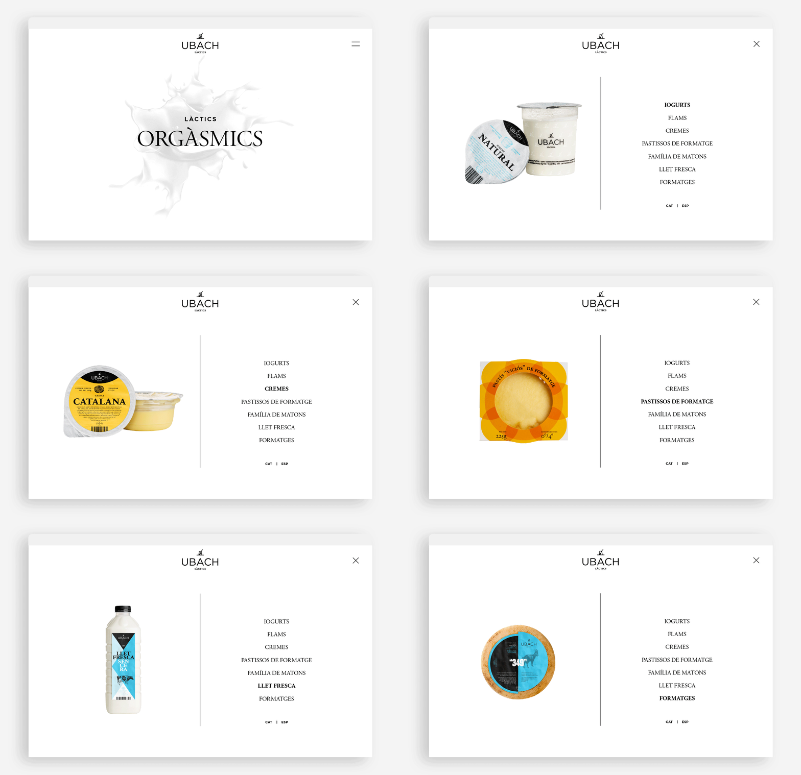
The new identity that we propose at Suki replaces the term "Vic" with the concept "Dairy", which is much more descriptive and representative for the brand. A new logo that leaves behind the retro typography to update it and incorporates a new symbolism: the glass yoghurt, which gives it the artisan character from which we come from.
Its products are authentic dairy products, made with all the love in the world, by the Master Artisan Ramon Miquel Ubach Sarrat.
We achieve this close character not only with the signature of his master, but also with a language that is close and colloquial, and even a little cheeky.
(
1
/
5
)
(
1
/
5
)
The main function of the new catalogue was to generate visual impact, which we achieved through a strong differentiation of product ranges with bold colour gradients and backgrounds and less conventional headlines.
(
1
/
5
)
(
1
/
5
)
Credits
Photography: Ivan Raga
Top
